29 June 2017

Spring Sprang

Our eighth spring at Small Pond Arts has come and gone. It was the rainiest spring we've experienced since moving here in 2010; while many people on our island experienced flooding, we are high up on a hill and lucky that the worst outcome has been having to mow the grass every five minutes! 

We kicked off the season with our annual banner-raising silobration.

Photo: Melanie Dailey

The symbol on this year's banner is a hobo sign; from the 1880's to WWII, hoboes placed markings on fences, posts, sidewalks, etc, to aid their fellow travellers in finding help or steering them clear of trouble. We found this symbol especially poignant - a message of encouragement from one person to another.

We have been overrun with rabbits this spring; we easily spot a dozen bunnies a day, with lots of adorable babies running around. This cuteness just doesn't get old!


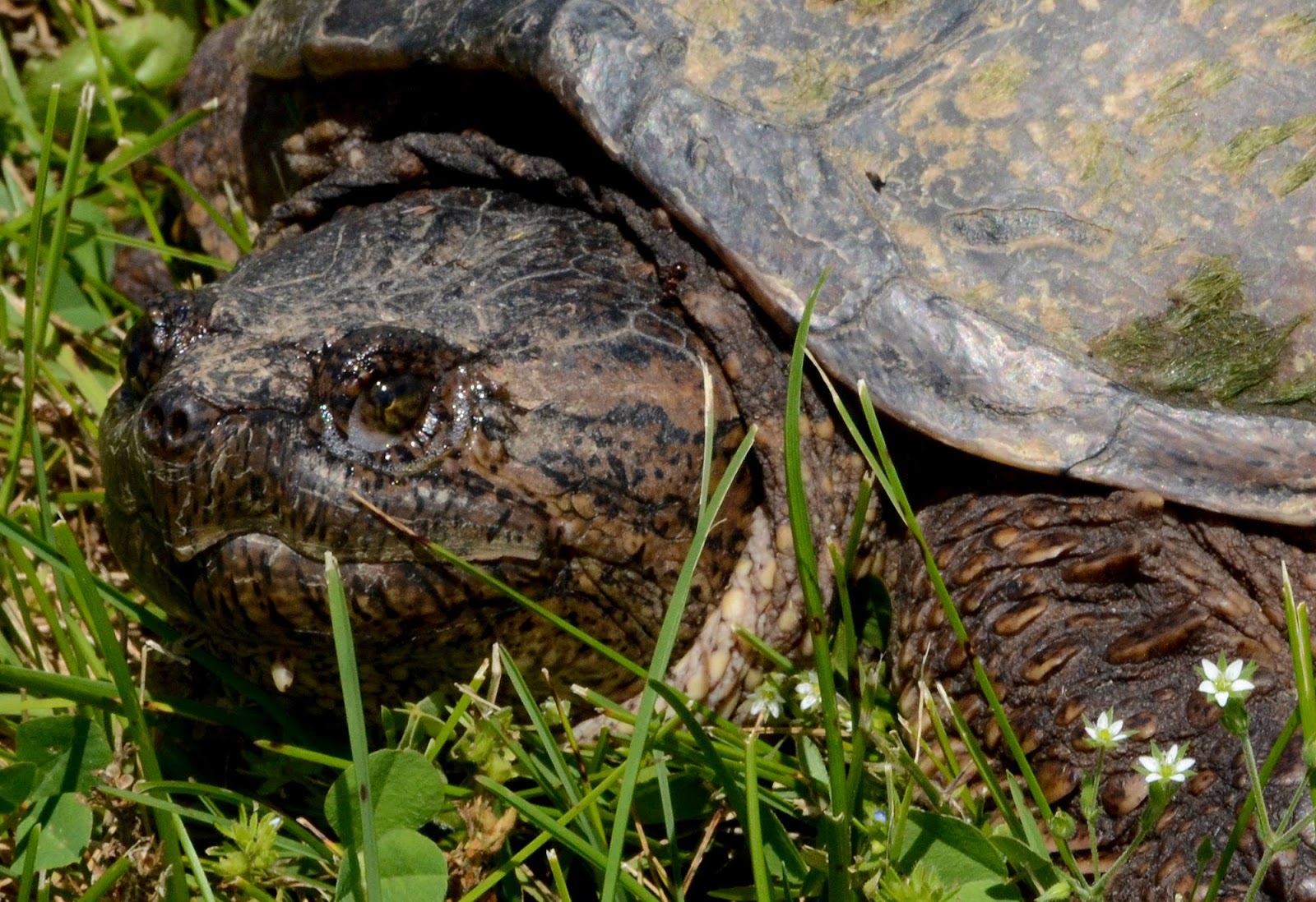
We also had a very special visitor pass through: a snapping turtle moseyed across the lawn one day.


We've had a few artists in residence so far, and the busy season is upon us with some 20+ more artists passing through in the next two months.

Montreal artist Stéfanie Meunier works mostly in digital formats, but spent two weeks at Small Pond working analog with sketching and painting, and enjoying bunnies appearing at her feet while working outside the art barn.


We made an outing to Little Bluff Conservation Area to check out this wall of drift wood that the high waters had pushed onshore. Normally it's only pebbles on this beach, so this was quite an unusual site!


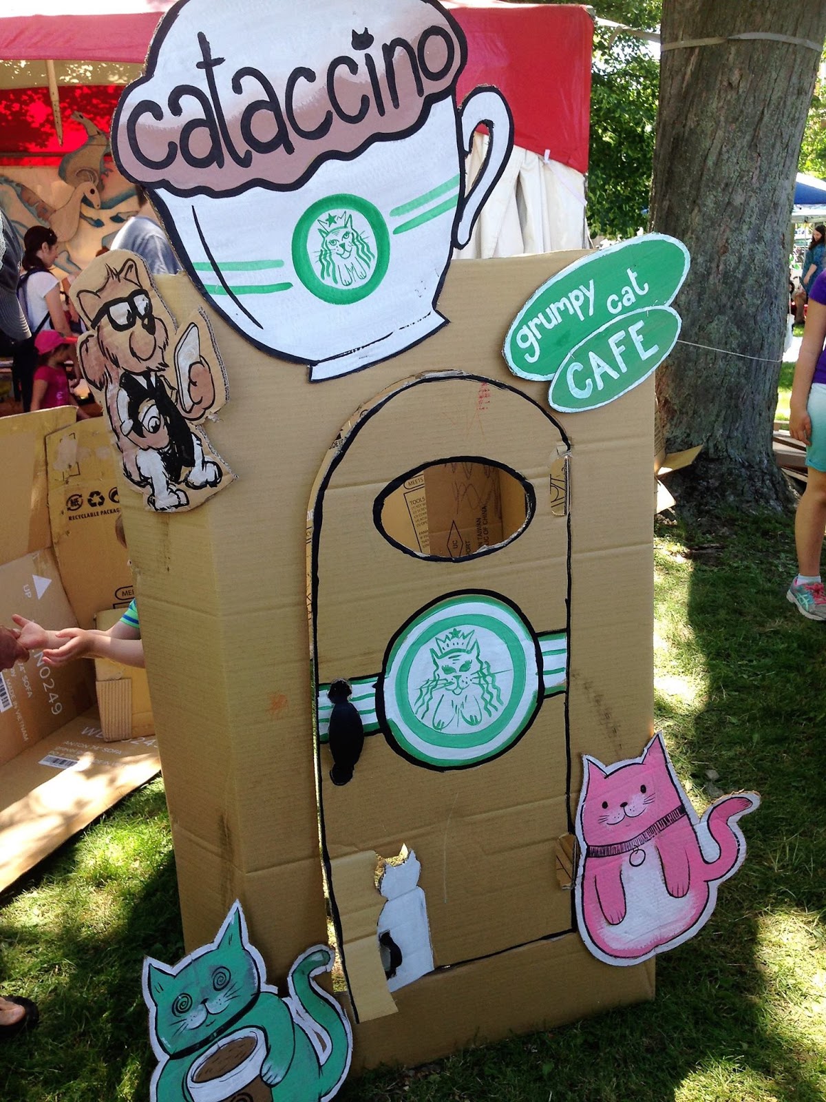
We held our second annual Cardboard Camp getting ready for Skeleton Park Arts Festival. It was totally fun and an inspiration to be working alongside such talented artists.

L to R: Chrissy Poitras, Nella Casson, Kevin Merritt, Holly Gilmour, Krista Dalby

This year our theme was Boxtopiaville. We created an urban environment with all the necessities, like a cat cafe...


... A bike shop, with a nod to our cardboard sponsor, Bloomfield Bicycle Company...


...And a Wheel of Fate that was eagerly spun by many.

Artist: Kevin Merritt

I also had the pleasure of working with Aleks Bragoszewska of Bird Bone Theatre to help animate the Porch Jazz Parade.


And furthermore in cardboard news, I received an honourable mention at Art in the County for my sculpture, Corrugated Cohen. Sweet!

Corrugated Cohen by Krista Dalby

Now it's time to eat our Wheaties as we launch into full-on summer mode. If you're in the area, come for a visit!

25 April 2017

Season 8 "Street Ads"


Because of its complexity and a severe lack of time (mostly focusing on two very large portraits), I didn't get around to executing my idea for an April Fools' gag this year, but I have fun with them (my favourites being the Vaporators and Video Games gags), so I'll make sure I do one next year, even if it's a different idea.

That said, I did create some "street ads" for our upcoming Season 8 starting in May that are sort of in an April Fools' vein because they're not real but meant to appear so (just like our Season 6 promotion gag). And no, I have no idea how much it would have cost to actually buy these ads.

I started by designing a poster in CorelDraw using photos of various Small Pond scenes (the silo, bike, and the Milky Way, our first barn quilt, and a large triptych I painted last year), but the key element was the 1970s-inspired Season 8 logo to stand out front and centre. The '70s angle was to tie in the "celebrity endorsements" I had in mind (see below) –plus, I like that aesthetic.


Next, I took a number of photos of bus shelters and streetcars while on a short visit to Toronto with PhotoShoppery in mind (angles and lighting were key concerns). As usual, I shot way more than I needed so I could pick the best ones for the project.


Stopped at a red light, camera ready, I got this nice shot of a TTC streetcar showcasing the ad panels.
This narrow, horizontal layout made including the photos difficult, and since the logo and the date covered the "what," "when," and "where," I eliminated the pictures to be as concise as possible.


This was shot near our old neighbourhood at the intersection of College and Ossington (I was heading northbound). I liked the angle and street elements, but knew that the foreground glass was going to make this one a real challenge –a challenge that would end up making this one look the most realistic if my digital surgery skills were up to the task.


As you can sort of see, a lot of work went into recreating all the elements that would be in front of the poster were it really inside that bus shelter. It's never just a matter of cut-and-paste! I wasn't too worried about obscuring the poster too much (it would be seen clearly in the first photo up top) –in fact, the poster itself is a bit of a MacGuffin since the logo was the most important feature as far as legibility was concerned. 


Of course, what's a fun PhotoShop project without bizarre anachronisms? Celebrity endorsements are one thing, but time travel is way beyond our capability for now. In any case, John and Debbie seem to be enjoying the only Small Pond shirts we've ever "made."